


Key takeaways:
- Visual hierarchy guides the viewer’s eye, making information more engaging and comprehensible.
- Key benefits include enhanced readability, prioritized information, emotional impact, and improved brand identity.
- Effective techniques involve strategic use of color, typography, and spacing to create a clear path for the audience.
- Avoid common mistakes like overwhelming competing elements and neglecting alignment to maintain clarity and focus.

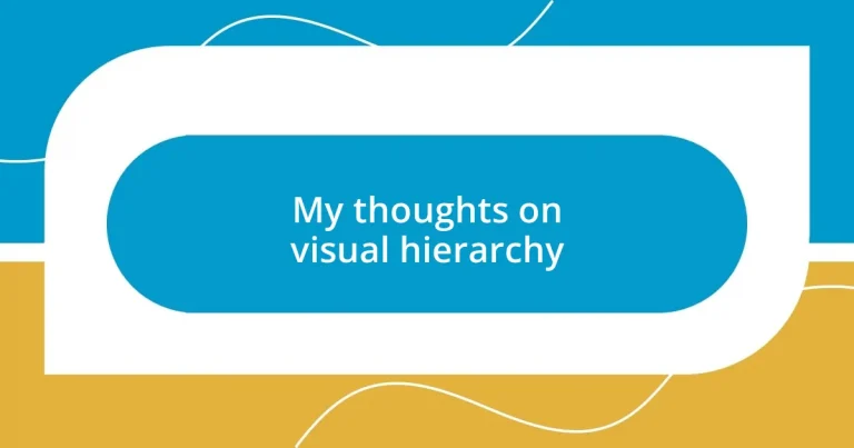
Understanding visual hierarchy
Visual hierarchy is all about how we arrange elements to guide the viewer’s eye through a design. Think about your favorite magazine; isn’t it fascinating how your attention is drawn first to a headline, then to the images, and finally to the smaller text? This isn’t by accident; it’s a crafted experience that taps into our instincts.
When I first began studying design, I remember struggling with how to prioritize information on a page. I often asked myself, “What captures my attention the most?” By experimenting with font sizes, colors, and placements, I discovered that using bold headings and contrasting colors can dramatically affect engagement. It really opened my eyes to how we subconsciously respond to visual stimuli.
Have you ever noticed how a well-designed website can keep you scrolling while others leave you feeling lost? That’s the magic of visual hierarchy at work. It creates a path for the viewer, making it easier to absorb information without feeling overwhelmed. Understanding this principle can truly transform how you communicate visually, making your work not just more effective but also more enjoyable for the audience.
Importance of visual hierarchy
Visual hierarchy isn’t just a design concept; it’s a crucial element that impacts how information is perceived and understood. When I started working on various projects, I realized that ignoring this aspect often led to confusion among viewers. I remember receiving feedback on a project that seemed too busy, and it hit me—there was no clear journey for the reader’s eye. I learned that proper arrangement of elements can help people navigate content effortlessly, enhancing both engagement and retention.
To fully appreciate its importance, consider these key benefits of visual hierarchy:
- Enhances readability: By guiding the eye through text and images, it improves comprehension.
- Prioritizes information: Key messages stand out, making them easier to grasp quickly.
- Creates emotional impact: A well-structured design elicits feelings and strengthens connections with the audience.
- Encourages action: Clear visual cues can lead people to interact with content, like clicking a button or signing up for a newsletter.
- Builds brand identity: Consistent use of hierarchy reinforces brand messaging, making it recognizable and memorable.
Understanding the importance of visual hierarchy is a game-changer. It’s about creating a seamless experience where information flows naturally, making your design not only functional but also enjoyable.

Key principles of visual hierarchy
When I explore the key principles of visual hierarchy, one aspect that stands out is the use of size and scale. Larger elements instantly grab attention, whether it’s a bold headline or an eye-catching image. I often find myself drawn to designs that utilize size effectively; it’s almost like a conversation, where the most important voice rises above the rest. Conversely, smaller text may seem less significant, but it can play a crucial role in supporting larger elements.
Another principle I’ve come to appreciate is contrast. Using contrasting colors and styles can dramatically influence how I perceive information. For instance, when I came across a website design using dark backgrounds with bright text, I realized how much it impacted my engagement. I felt energized as my eyes scanned the screen, clearly defined sections guiding me through the content. It’s remarkable how contrast doesn’t just enhance visibility; it also creates emotional responses that really resonate with viewers.
Finally, spacing is vital in establishing hierarchy. I remember feeling overwhelmed by cluttered designs early in my career, which made it hard to focus. Now, I see space as the breathing room that allows each element to speak for itself. The right amount of white space can create a sense of harmony and sophistication, inviting the viewer to explore without the pressure of visual overload.
| Principle | Description |
|---|---|
| Size and Scale | Larger elements capture attention quickly, indicating importance in the hierarchy. |
| Contrast | Using differing colors and styles enhances visibility and engagement, creating emotional connections. |
| Spacing | Strategic use of empty space allows elements to stand out, promoting clarity and focus. |
Techniques to enhance visual hierarchy
One effective technique to enhance visual hierarchy is through the strategic use of color. I still remember a project where I utilized a vivid accent color for call-to-action buttons. The transformation was astonishing; users were instantly drawn to those areas, resulting in a significant increase in click-through rates. Color gives each element a unique voice, prompting viewers to discern what deserves their attention.
Another technique I’ve found invaluable is the implementation of typography. Different font styles can create a visual rhythm that guides readers through content. I once redesigned a report by mixing a bold serif font for headings with a clean sans-serif for body text. This combination not only heightened readability but also established a clear path for my audience’s journey. Can you recall a time when a particular font made reading easier or more engaging? It’s a powerful tool that shapes perceptions and influences emotions.
Lastly, layering elements can add depth and interest to your design, making it more engaging. I remember working on a marketing email where I overlapped images with text boxes, creating a dynamic feel. This technique isn’t just about aesthetics; it allows for nuanced storytelling. How do layers encourage interaction? They create a sense of hierarchy that invites viewers to explore more, prompting them to dig deeper into the content.

Common mistakes in visual hierarchy
One common mistake I often see in visual hierarchy is the overwhelming use of competing elements. I remember a specific client project where multiple call-to-action buttons were all the same size and color, leading to confusion. It’s as if each element was shouting for attention, but instead of drawing users in, I found that they clicked away, overwhelmed by choices. Have you ever faced a similar dilemma when navigating a cluttered design?
Another frequent pitfall is neglecting the importance of alignment. I once attended a seminar where a presenter used misaligned text and images, which created a sense of chaos instead of order. It struck me how vital alignment is—it brings cohesion to a design, guiding our eyes naturally from one point to another. When elements are poorly aligned, it disrupts the flow and can even frustrate the viewer. Isn’t it fascinating how something so simple can make such a difference in user experience?
Lastly, relying too heavily on decorative fonts can easily backfire. I had once experimented with a fancy script for a poster, which looked beautiful but was challenging to read at a distance. I learned that while aesthetics matter, clarity should never be sacrificed for style. It’s a delicate balance; sometimes, a clean and straightforward font can communicate more effectively. Have you found yourself in a similar position, where a design choice that felt trendy ended up detracting from your message?

Real-world examples of visual hierarchy
The impact of visual hierarchy is vividly illustrated in popular e-commerce websites. Take, for example, an online clothing store I explored recently. The way they highlighted sales through larger images and bold text drew me in immediately. It felt effortless to zero in on the discounts, making my shopping experience not only enjoyable but also efficient. How do you feel when a website instantly guides you to what you want?
Another powerful real-world example can be found in magazines. I distinctly recall flipping through a fashion magazine where the cover story featured stunning visuals coupled with an eye-catching headline. The layout was masterfully done, with the most important elements standing out while maintaining harmony. Each section led me like breadcrumbs through the narrative, making me eager to dive into the inside pages. Does the arrangement of images and text ever influence your decision to read an article?
Lastly, consider the way educational materials employ visual hierarchy to aid learning. In my experience, textbooks often use bullet points, subheadings, and visuals strategically to manage the flow of information. I remember a particularly well-designed science textbook that used diagrams alongside concise explanations. This balance made complex concepts much more digestible and engaging. Have you ever been captivated by a textbook because of its effective layout? That’s the magic of visual hierarchy at work.
Tools for creating visual hierarchy
When it comes to creating an effective visual hierarchy, I find that tools like Adobe XD and Figma are indispensable. I remember once using Figma in a collaborative project, where the real-time feedback made it so easy to adjust sizes and alignments on the fly. It was a game changer for organizing elements visually—do you feel that instant impact when you tweak a design in the moment?
Another tool that I’ve experimented with is Canva, especially for quick layouts. I was designing a social media post recently and discovered their templates facilitate a clear hierarchy with just the right balance. It prompted me to think about how spacing and color can influence focus—have you noticed the difference when a template aligns elements effectively versus a more chaotic arrangement?
Lastly, I can’t stress enough the value of wireframing tools like Balsamiq. In my experience, sketching out a visual hierarchy before diving into the full design saves a lot of headaches down the line. I once sketched a website layout on Balsamiq, and it became so clear what needed to be emphasized and what didn’t. Can you relate to that moment when everything just clicks into place visually? It’s truly rewarding to see your ideas come together, enhancing user experience through thoughtful design.